


Crocodile Agency: an interactive website that lets the work speak
An interactive website that lets the work speak: how we repositioned Crocodile Agency for corporate clients, built in React and Figma.
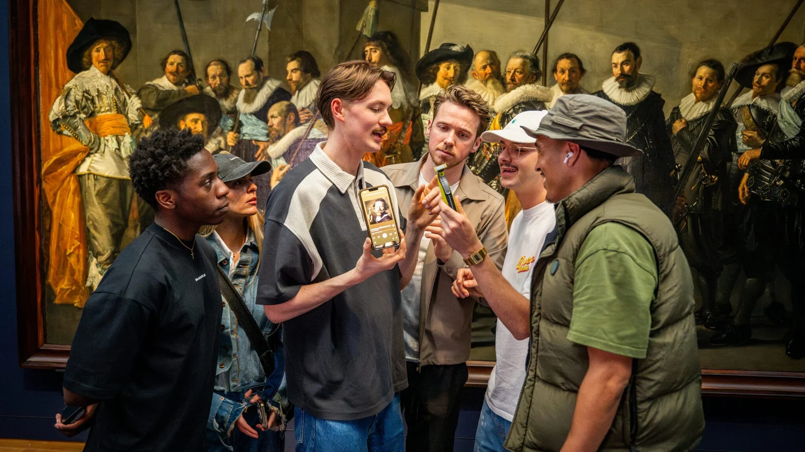
Crocodile Agency had a new corporate positioning. The trouble was, its website still showed its influencer past. We designed and built an interactive website in React, aimed at corporate clients, CMOs and creative leaders.
On this page you'll read how to reposition an agency without making a brochure. Spoiler: by saying less about yourself and showing more.
The project in brief
- Client
- Crocodile Agency
- Sector
- creative agency, marketing and campaigns
- What we did
- UX/UI design, custom web development
- Technology
- React, Figma
- Period
- about 10 weeks, from the first interview to go-live
What was the challenge at Crocodile Agency?
The site no longer fitted the agency Crocodile Agency had become. The visual style still pointed to its influencer past. There was too little room to show cases with visual impact. And the route through the site didn't lead visitors to a next step, so anyone who got interested hit a dead end.
It's a problem I see at more agencies. The work grows faster than the website. You pitch to big brands, but anyone who opens your site still sees who you were three years ago. A CMO who has doubts won't look any further. They'll click away.
A corporate client also talks in a different way from an influencer or a brand that wants quick reach. They want to see that you can handle big campaigns, that you think strategically and that you're easy to reach. A site that's mainly fun sells nothing there.
Why did we make the work the proof?
An agency that wants to appeal to corporate clients convinces with what it has made. Not with a description of itself. So we built the site around the cases: large, in motion and told in layers. From every case there's also a route to contact, so interest doesn't hit a dead end.
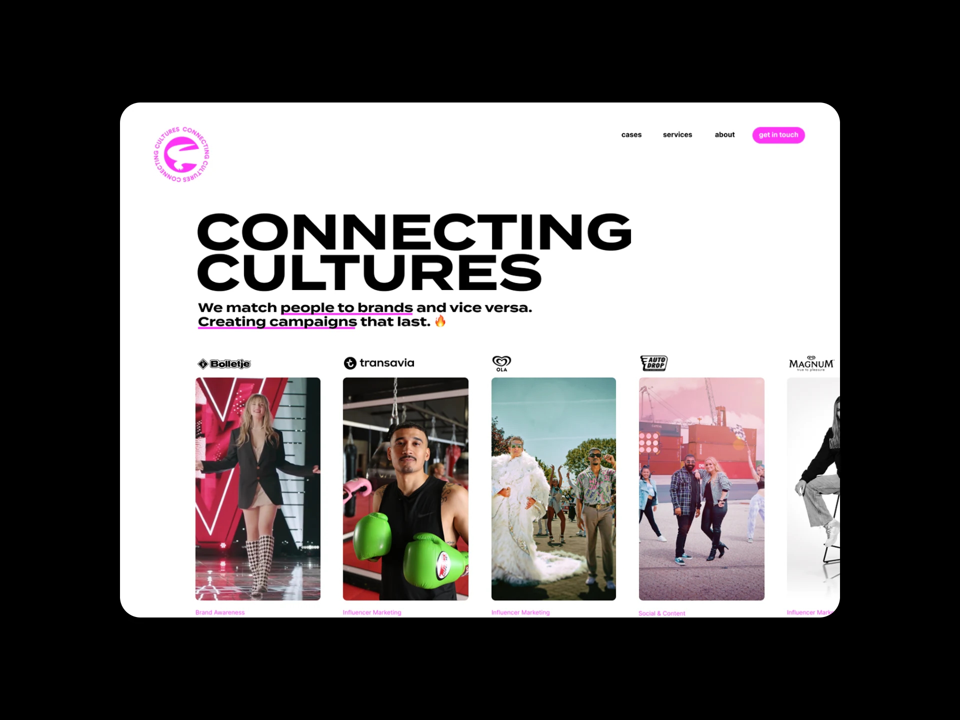
I'm allergic to agency sites that open with "we're a full-service agency with a passion for brands". Everyone says that. What not everyone can say is which campaigns they really have to their name. So the homepage shows campaign cards straight away, for Bolletje, Transavia, Ola, Auto Drop and Magnum, among others. Anyone who sees that doesn't need to ask the agency what it can do.
That choice also shaped the structure. A case here isn't a text page with a few photos underneath. It's a story that unfolds as you scroll.
Want to know what a site like this costs? Our page on the cost of a website explains the difference between a template and custom work.
How did we build the interactive website?
We translated the design from Figma, down to the details, into a responsive site in React. Micro-animations, scroll transitions and video carry the brand stories. The navigation follows the personas of the new target audience and behavioural data. The animations also run smoothly without hurting load times, because they were part of the build from the start.
A design with movement
Here we tell campaigns and cases in layers, instead of as a flat list. An image slides in, a video starts, a text follows. Still, movement isn't a goal in itself. I've seen plenty of sites where everything moves and nothing sticks. Here, every animation serves the work.
A flow based on personas
The navigation is built from the personas of the new target audience, supplemented with behavioural data on how visitors actually move through the site. Every touchpoint, from the homepage to a case detail, leads to a logical next step. So a visitor doesn't hit a dead end after reading a case, but is offered a next step straight away.
Why React?
React gives control over how and when animations play. At the same time it keeps the site fast and scalable. Because the animations are part of the build and weren't added afterwards, we could optimise imagery and transitions from the start.
Looking for a website that shows your work instead of talking about it? We design and build custom websites, from first sketch to go-live.
See custom website development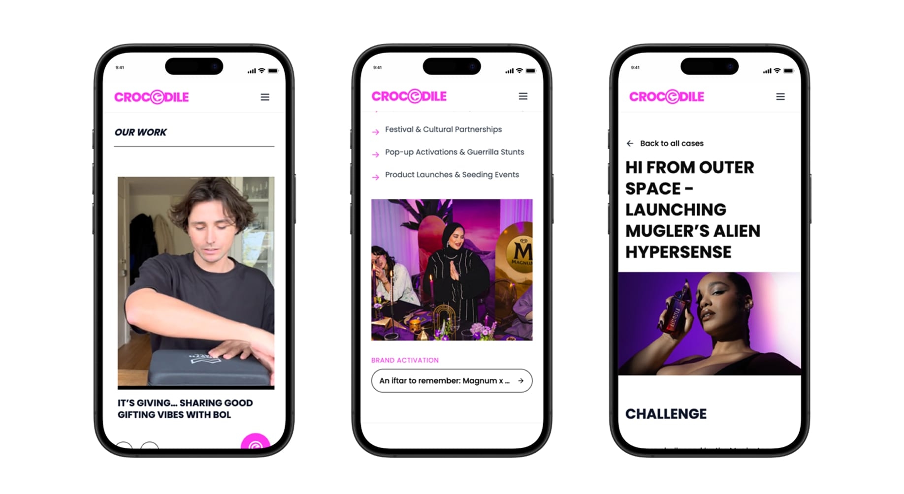
What does the design look like?
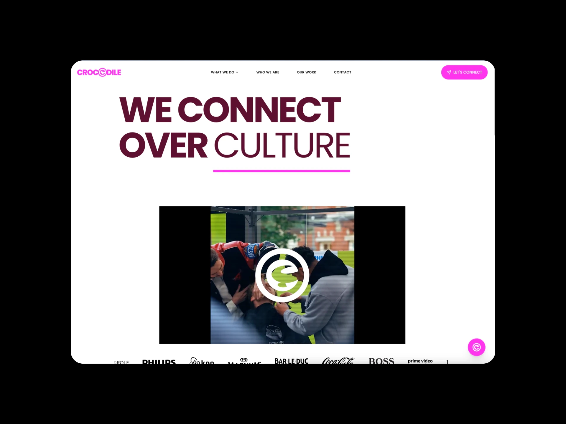
The new homepage opens with the headline "We connect over culture" and a showreel with a play button. Below it is a row of logos, including Philips, Bar-le-Duc, Coca-Cola and Boss. On a phone you see the work overview, a list of services with brand activations, and case pages.
One example of a case page is the launch of Mugler Alien Hypersense. Work like that needs space, and it gets it. Big visuals, short texts, and only then the explanation.
What I like most about this design is the calm. Despite all the movement, the site doesn't feel busy. That's because every page shows one thing at a time.
What did the interactive website deliver?
The site shows the work the way Crocodile Agency wants to talk about it. There are clear routes to contact, and new cases fit within the existing setup. So the agency doesn't have to call a developer to build a page for every new campaign.
What I learned from this myself: a redesign doesn't start with colours, but with the question of who your site needs to convince. Once that was clear for Crocodile Agency, most design choices followed naturally. That's why I now ask that question first on every website project.
“We're really delighted with the new website. From technology to creative: Your Tech Club supported us perfectly in every area and thought strategically with us about the right choices.”
What's more, the site was live within about 10 weeks, from the first interview to go-live. That was possible mainly because the target audience was fixed from day one.
Has your business changed, but your website hasn't? Show me where you are now, and we'll work out together what the site needs to do.
Book an intro callUpdated
Get in touch with us directly. We'll get back to you as soon as we can


 Your message goes straight to our team in Amsterdam.
Who built the Crocodile Agency website?
Your Tech Club. We did the UX/UI design in Figma and built the interactive custom site in React, tailored to the agency's new positioning.
What did Your Tech Club build for Crocodile Agency?
An interactive brand website with micro-animations, scroll transitions and video, and navigation built from the personas of the new target audience.
What technology does the Crocodile Agency website run on?
React, with the design worked out in Figma. React gives control over how and when animations play, while keeping the site fast and scalable.
Don't animations slow down load times?
Only if you add them afterwards. Here they're part of the build. That means imagery and transitions are optimised and the site stays responsive on every device.
Can a redesign convey a new positioning?
Yes, if the design takes the new target audience as its starting point. At Crocodile Agency that meant corporate clients and CMOs, and that calls for different choices than a site for influencers.