

Closing The Loop website: One for One explained in 30 seconds with 3D animation
A Closing The Loop website that explains the One for One model in half a minute, with a 3D animation and a CMS the team manages itself. Read how we did it.

Closing The Loop offsets electronic waste with a One for One service. For every phone sold, they collect one and have it recycled. A strong story, but one you need to be able to explain. That is why we built a new Closing The Loop website, with a single 3D animation at its heart.
In this case you can read why we deliberately pushed text into the background, when a 3D animation is worth the money and how the team now manages the site itself.
The project in brief
- Client
- Closing The Loop
- Sector
- circular economy, electronics recycling
- What we did
- UX/UI design, custom web development, 3D animation, CMS implementation
What did the Closing The Loop website need to do better?
The old site couldn't get the story across. Anyone who had never heard of the One for One model read a paragraph about it and was still left wondering how it works. And anyone who did understand it got no clear next step. The story itself was good. The packaging wasn't.
The old homepage had an orange bar, a collage of collected phones and the heading "First step to greener devices". Well meant. But after that heading you still don't know what happens when you team up with Closing The Loop.
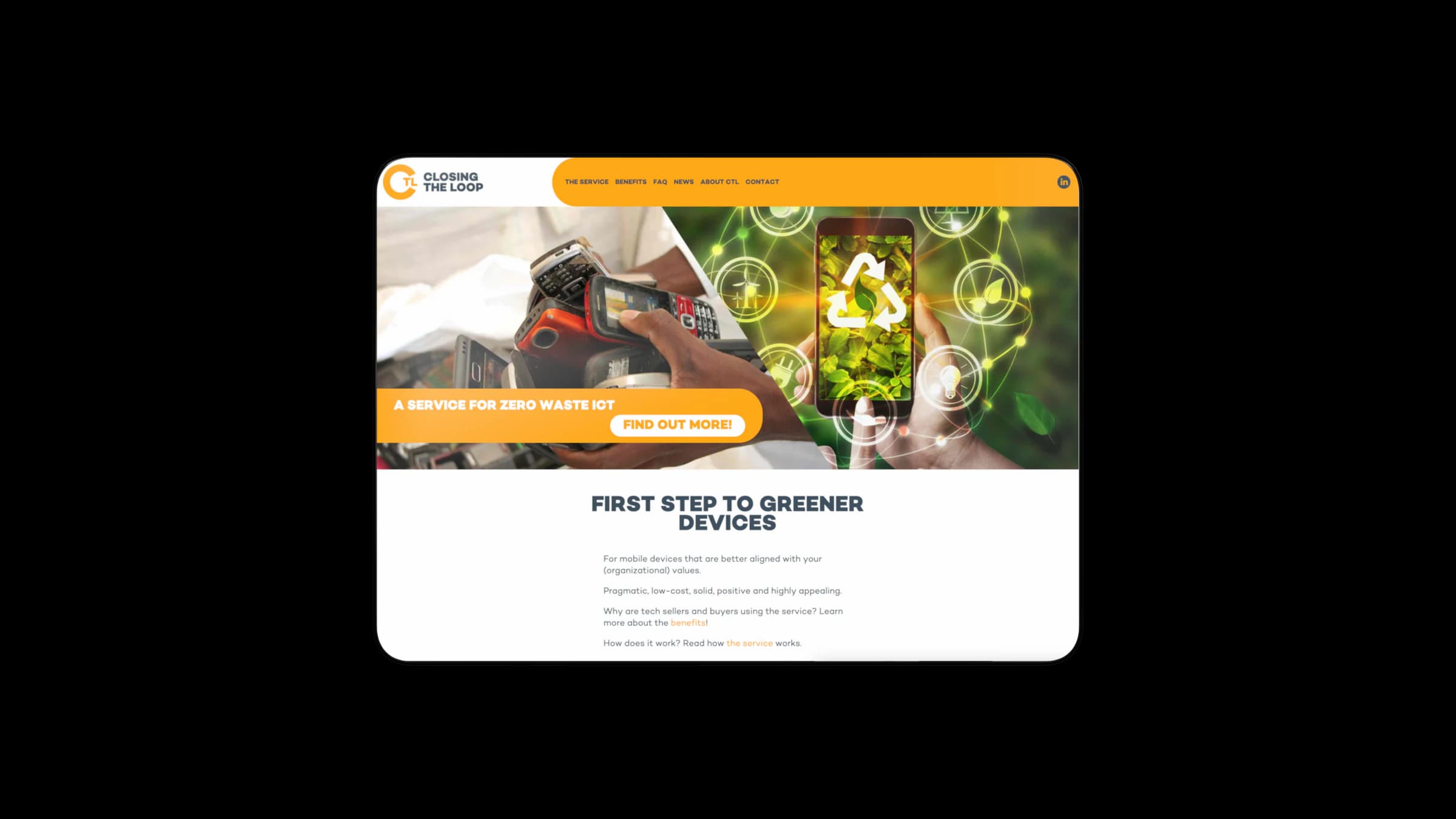
In my view, this is a trap for every company with a new kind of service. You know your own model so well that you forget how strange it is to someone hearing about it for the first time. So you write a paragraph that says everything to you, and nothing to the visitor.
Why did we choose a 3D animation instead of text?
Because a circular model is a movement. One phone is sold, another is collected and processed. A loop like that is easier to show than to describe. That is why the site revolves around one animation, and the text around it serves that animation. The text supports, the movement explains.
A 3D animation isn't always a good idea. My rule of thumb: it is worth it if your service is a process people don't know. At Closing The Loop it is a chain with several steps. That takes paragraphs of text nobody reads, while an animation simply shows it.
Is it something people already understand, like an online store or a hair salon? Then a 3D animation is mostly expensive wallpaper. Here it was exactly the right tool.
Do you have a service people don't get in one sentence? Then a website that shows instead of tells will help.
See custom website developmentHow did we build it?
We built a custom website around a 3D animation that shows step by step how discarded phones are collected and recycled to offset the environmental impact. Around it sit partner case studies and an explainer page. The team manages everything itself through a CMS, and the site is built mobile-first.
The 3D animation
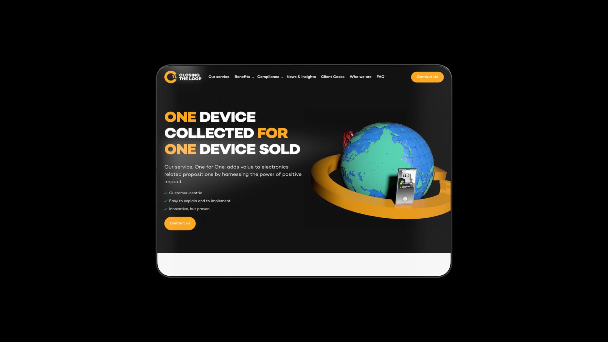
The new homepage opens on a dark panel with the heading "One device collected for one device sold". Below it, a phone circles a 3D globe. Without reading a single line of text, you can already see what it is about: phones go round, the world benefits.
Proof from partners
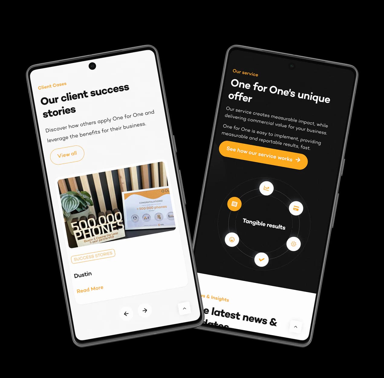
Highlighting partners such as Vodafone and T-Mobile was part of the brief for the site from the start. So a separate section shows case studies from Closing The Loop partners, including Vodafone, KPMG and T-Mobile. That way a visitor sees straight away where the model is already working in practice. A milestone of 500,000 collected phones is also in view. That kind of proof works better than any promise you write yourself.
Step-by-step explanation
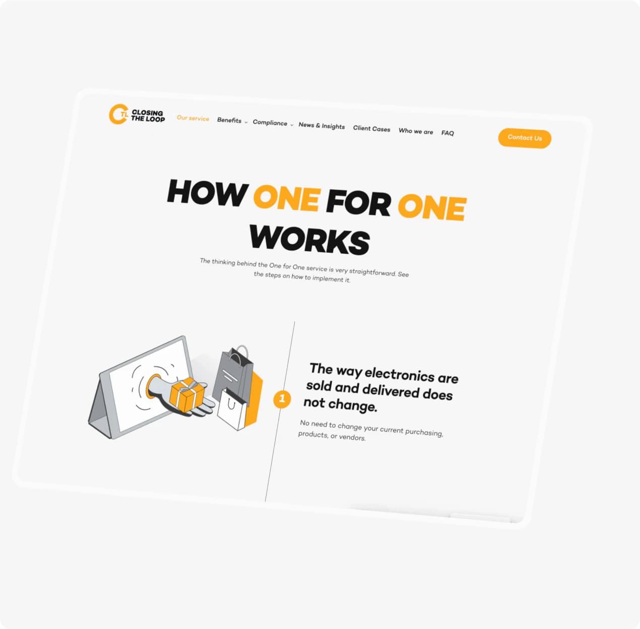
On the "How One for One works" page, the visitor walks through the model step by step. An illustration of a parcel coming out of a screen opens the first step. Anyone who wants to know more after the animation finds the details here.
What does the design look like?
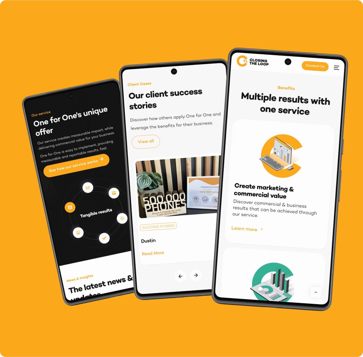
The design combines dark panels with orange accents and plenty of room for visuals. On mobile, the service blocks, the customer stories and the overview of results per service stack neatly. The site was designed mobile-first, because most of the traffic comes in on a phone.
Mobile-first here really means starting with the phone. So not making a desktop design first and then shrinking it. That keeps the message standing on a small screen too, and that is where most visitors see it.
What did the new Closing The Loop website deliver?
The animation makes the service clear in about thirty seconds, where text alone stayed abstract. The case studies show the proof at organisations the visitor knows. And the team updates pages and cases itself, without a developer.
Thirty seconds sounds short. But for a visitor who doesn't know you yet, half a minute of attention is already a big favour. So you have to use that time well, and that is what the animation does.
What can the team do with it now?
The CMS is set up for independent management. Closing The Loop updates pages and cases itself, without a developer and without outside support. When a new partner comes on board, that case is online the same day. If you'd still like someone to keep an eye on things and maintain the site, that is possible with website maintenance.
You'll find more examples among our cases, for instance how we built scalable ecommerce for an audience of millions for RUMAG. Want to know first what budget to expect? Take a look at the cost of having a website built.
Do you have a good story that isn't landing online? Tell me what you do and we'll work out together how to show it.
Book an intro callUpdated
Get in touch with us directly. We'll get back to you as soon as we can


 Your message goes straight to our team in Amsterdam.
Who built the Closing The Loop website?
Your Tech Club. We did the UX/UI design, built the custom website, made the 3D animation and set up the CMS the team uses to manage the site itself.
What did Your Tech Club build for Closing The Loop?
A custom website where a 3D animation explains the One for One model, with a section for case studies and a CMS for independent management. The site is built mobile-first.
When is a 3D animation worth it?
When your service is a process people don't know. At Closing The Loop it is a circular chain with several steps. That takes paragraphs of text nobody reads, while an animation shows it in about thirty seconds.
Can our team manage the site itself?
Yes, that was the starting point here. The CMS is set up for independent management, so the team updates pages and cases without outside support.
Why mobile-first?
Because most of the traffic comes in on a phone. By starting there instead of shrinking a desktop design, the message stays standing on a small screen too.