

A website for Bar-le-Duc that sends you to the shelf
A website for Bar-le-Duc that leads to the shelf: a 3D product experience, festival calendar, store finder and a giveaway with codes on 1.5 million bottles.
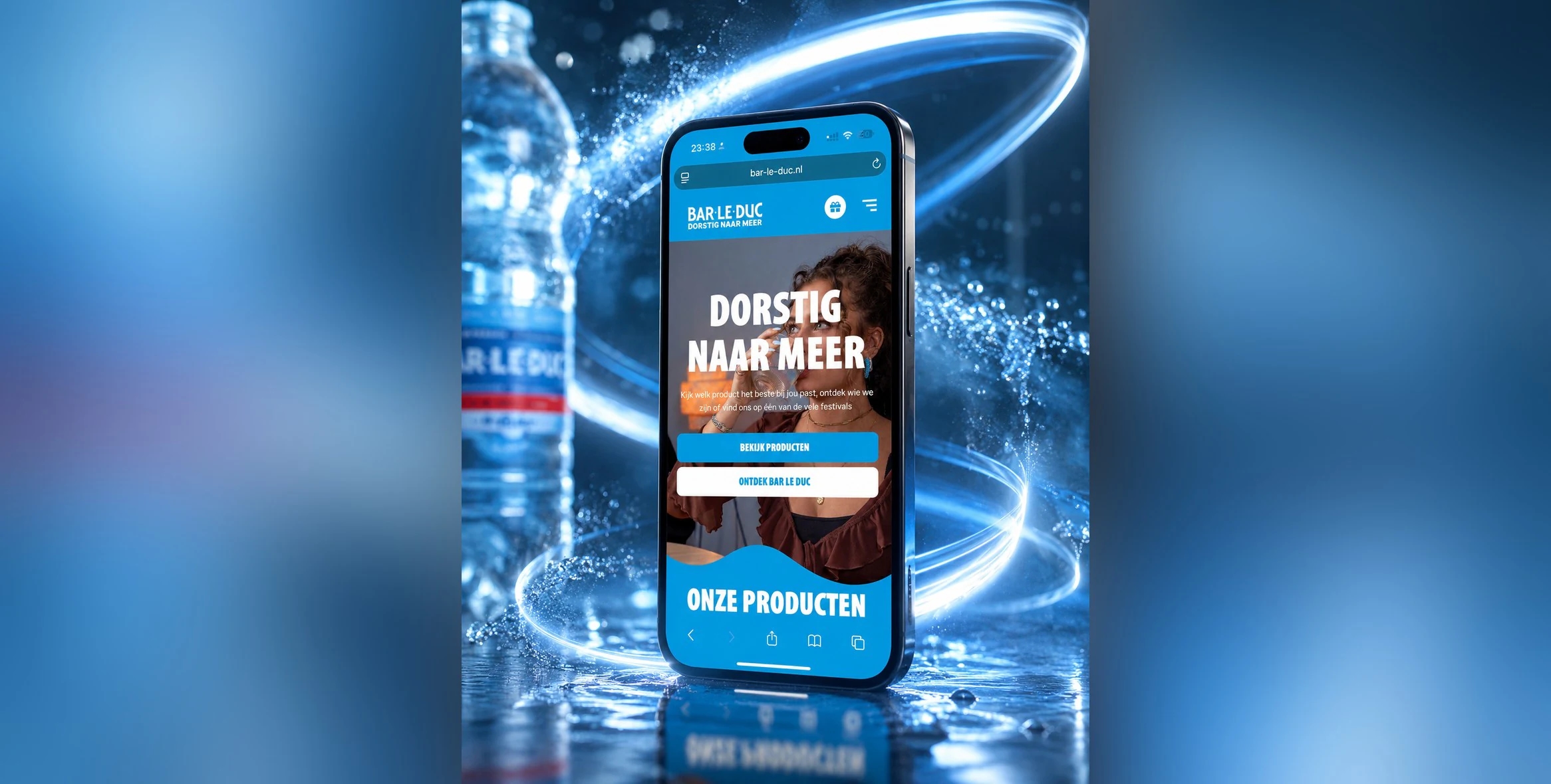
Bar-le-Duc is a family business that sources mineral water from a spring on the Utrechtse Heuvelrug. The brand targets young people aged 16 to 28 and sells through supermarkets. We built the new website for Bar-le-Duc, together with Crocodile Agency for brand and creative.
What made this project different from most: there is nothing to buy on the site.
In this case, you can read how to build a brand site that builds preference instead of selling, and how a simple code under the cap brought tens of thousands of people to the site.
The project in brief
- Client
- Bar-le-Duc
- Sector
- drinks, mineral water
- What we did
- UX/UI design, custom web development, 3D product experience, prize promotion module with codes
- Technology
- custom website with a CMS, multilingual and modular, GSAP for the 3D animations, Hotjar for behavioural data
What did the new website for Bar-le-Duc need to do better?
The old site didn't tell the brand story and didn't prompt visitors to do anything. The design felt dated and clear next steps were missing. On top of that, the site no longer matched the energy of the marketing campaigns Bar-le-Duc had just run. And the marketing team wanted to manage the site themselves, without calling a developer for every change. Because Bar-le-Duc sells through supermarkets, the new site mainly had to build preference for the brand and lead people to the shelf, not to a checkout page.
That sounds like a detail, but it changes everything. You measure an online store in orders. You measure a brand site for a supermarket product in something harder: does someone at the shelf choose your bottle? That calls for different design choices.
Why did we choose showing over telling?
Because the core of the brand is hard to capture in text. It is about the spring, the journey the water takes and what happens to the bottle after use. That works better with imagery and interaction than with a page of text. The mission, drinking at least two litres of water a day, is also better to try for yourself.
Let's be honest: an audience of 16 to 28-year-olds doesn't read long paragraphs about water sources. I wouldn't either. So we made it something to look at and play with.
How did we build the website?
We built four components around the brand story: a 3D product experience, a festival calendar, a store finder with a hydration check and a prize promotion with codes on the bottle. Each component has one job: let people experience the brand, or bring the visitor one step closer to the bottle. The team manages everything themselves in the CMS.
3D product experience
Visitors view the products from every angle and explore the packaging up close. The recycling process is also built as a visual journey. So you see the life cycle of the bottle made from 100% recycled plastic, instead of reading about it.
My rule with 3D: only use it if it shows something a photo can't. That was the case here, because you can't fit the packaging from every angle and the bottle's journey into one picture.
Festival calendar
For each event, the site shows details such as the date, the location and extra information. That way, the online calendar ties in with where the brand shows up offline: in the places where a young audience comes across it.
Store finder and hydration check
The store finder shows the nearest stockist based on postcode. For a brand without an online store, that is really the most important button on the site. The hydration check then works out how much water someone needs a day, which is exactly what the two-litre mission is about.
Do you sell through retail and want your website to lead to the shelf? Then you need different building blocks from an online store.
See custom website developmentPrize promotion with codes on the bottle
A consumer buys a bottle and scans the QR code on the label. They then enter the unique code under the cap, choose a prize and see straight away whether they have won. The platform checks whether a code is valid and hasn't been used before. Then it registers the entry.
The beauty of a code under the cap is that you don't need to keep or photograph anything. Open the bottle, enter the code, done. Because the fewer the steps, the more people take part.
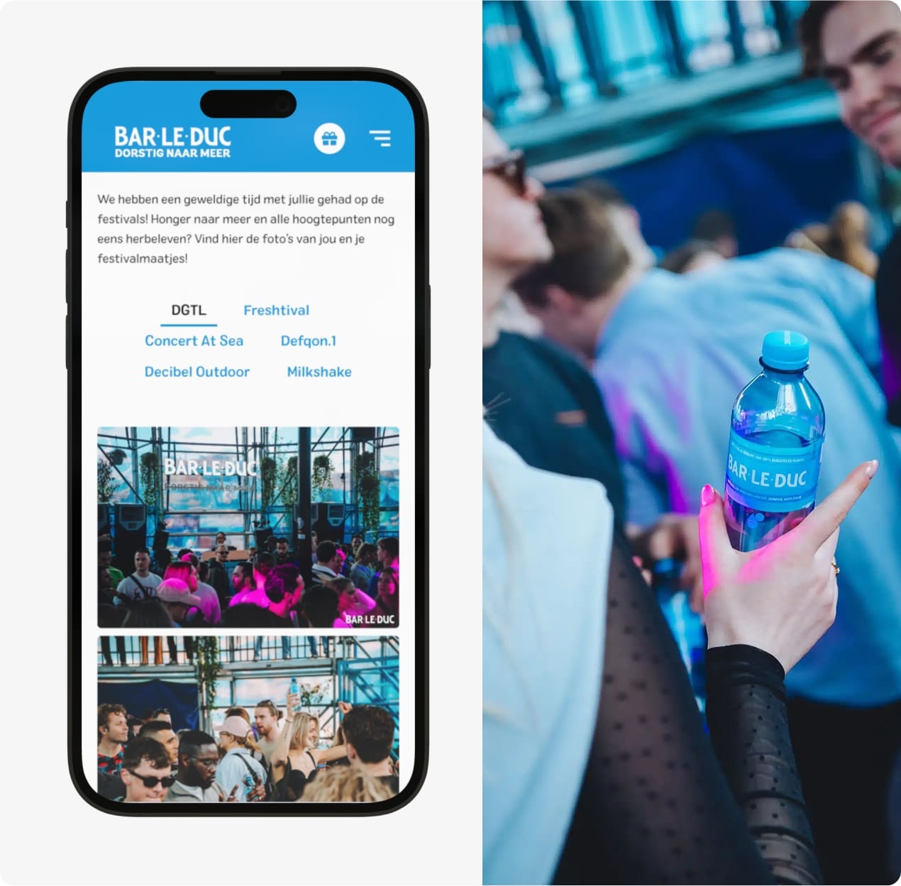
Behind the promotion is a dashboard with real-time entry data. In it, Bar-le-Duc sees the number of participants, how often which products were bought and the statistics per promotion. So nobody has to wait for a report afterwards.
What does the design look like?
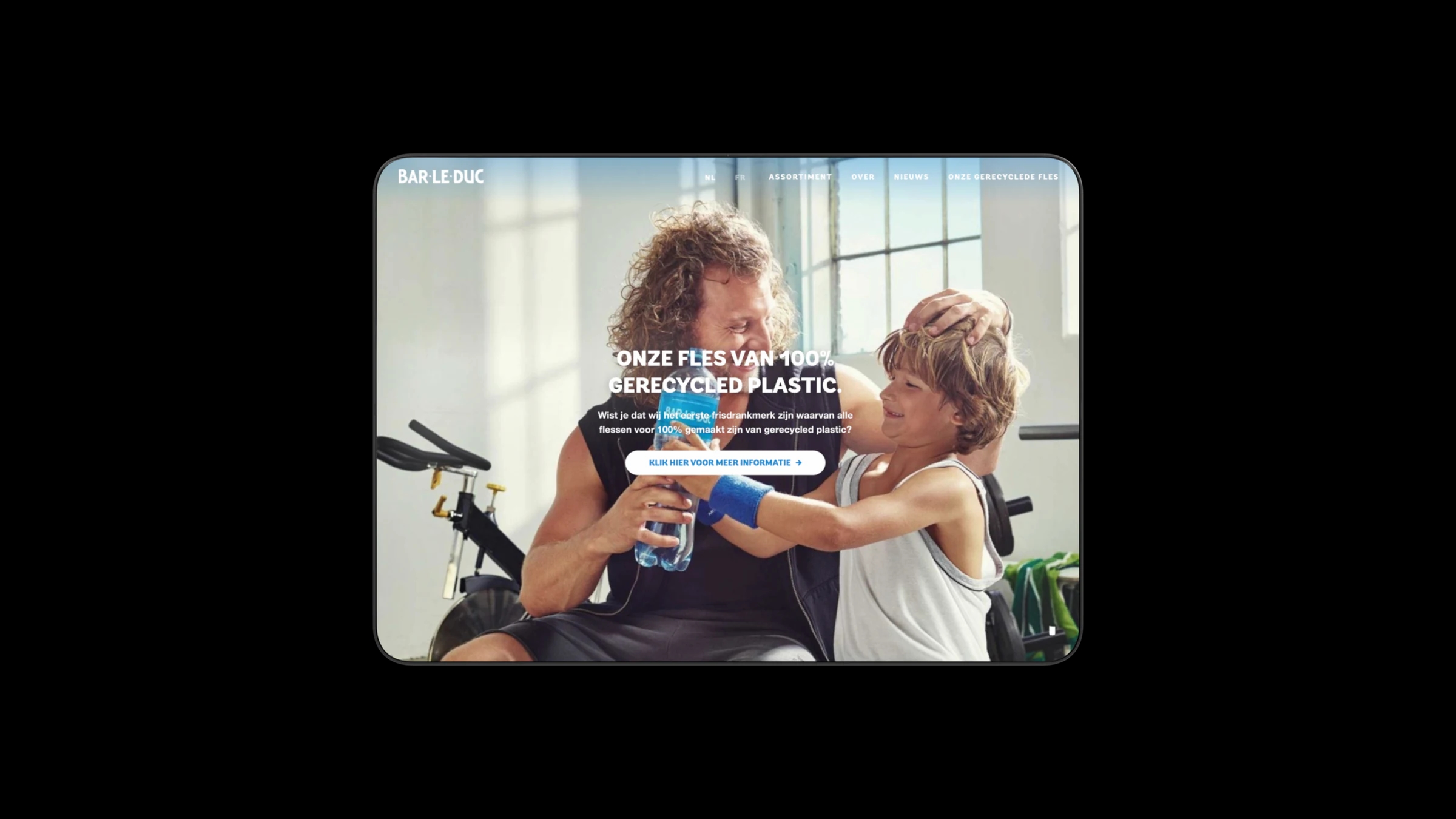
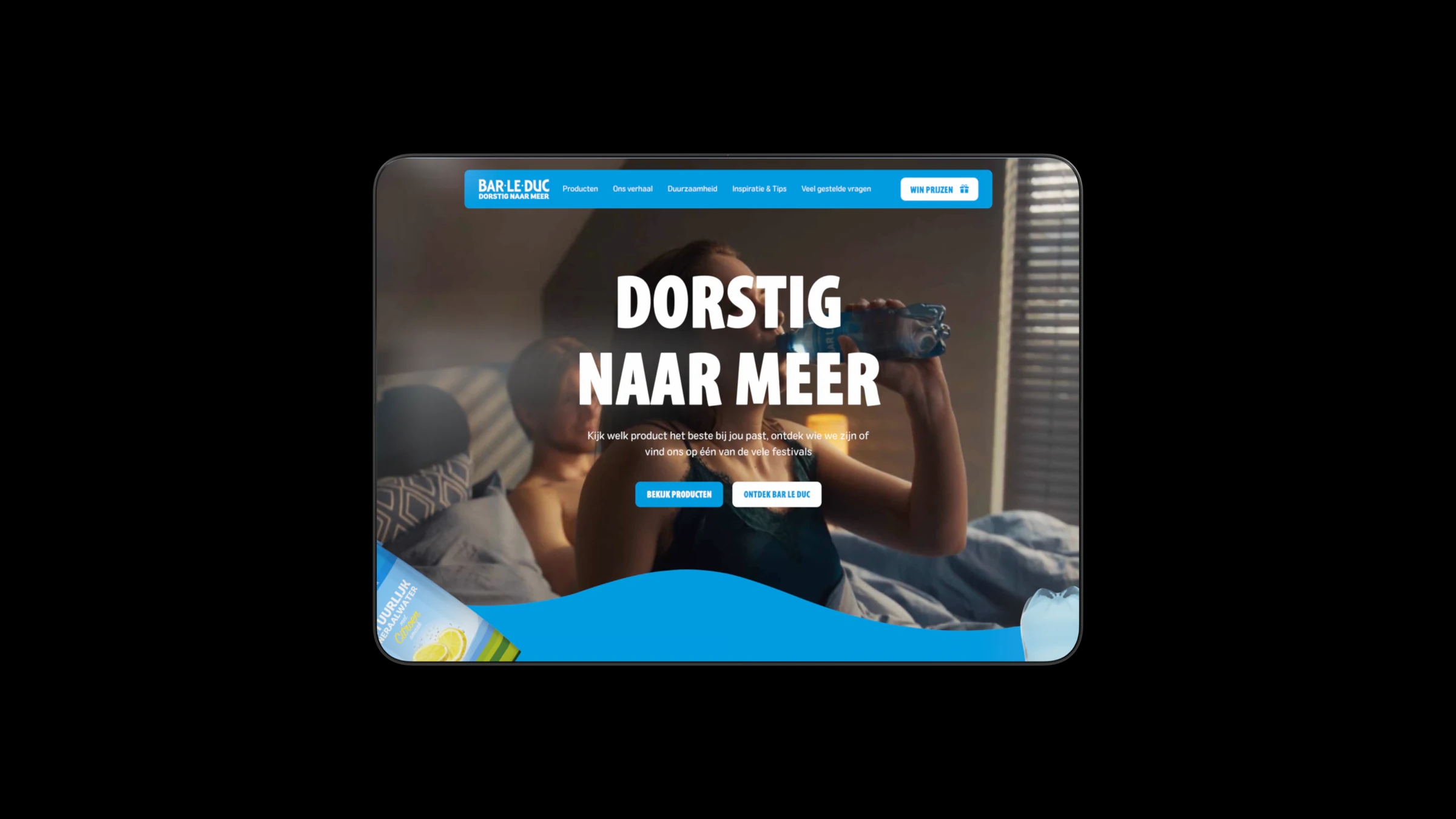
The design is visual and centres on movement. The homepage opens with the headline "Dorstig naar meer" (thirsty for more), a video of someone drinking and buttons to the products and the brand story. On the page about the bottle, a father and son share a bottle of Bar-le-Duc at the gym.
Crocodile Agency took care of brand, campaign and content, and we did the UX/UI design and the build. We built the animations with GSAP, and with Hotjar we see how visitors move through those visuals. That split worked well, because everyone did what they are good at.
What did the website for Bar-le-Duc deliver?
A campaign code sat under the cap of more than 1.5 million bottles in supermarkets. The promotion generated tens of thousands of entries and brought a large share of those participants to the website for the first time. That is exactly what a brand without an online store needs: people who seek out the brand.
What made the promotion work, in my view, is the instant feedback. No draw weeks later, but an answer right away, while someone has the bottle in their hand.
What can the team do with it now?
The team manages the festival calendar, product information, articles and campaign pages themselves in the CMS. The site is multilingual and modular, so a new campaign fits onto the existing building blocks. For Bar-le-Duc, we also built Bar-4-Bar, a music platform.
Curious how a prize promotion works with till receipts instead of codes? Read the case on the Verkade prize promotion. And to find out what a similar brand site costs, see the cost of having a website built.
Do you want a brand site that does more than look good? Tell me where your visitors need to go after your site, and we'll build towards that.
Book an intro callUpdated
Get in touch with us directly. We'll get back to you as soon as we can


 Your message goes straight to our team in Amsterdam.
Who built the Bar-le-Duc website?
Your Tech Club. We did the UX/UI design and development of the custom website, including the 3D product experience and the prize promotion module. Crocodile Agency took care of brand and creative.
What did the Bar-le-Duc prize promotion deliver?
Tens of thousands of entries. The campaign code sat under the cap of more than 1.5 million bottles in supermarkets, and a large share of participants came to the website for the first time through the promotion.
How does a prize promotion with codes on packaging work?
Every pack gets a unique code. The consumer scans the QR code, enters the code on the campaign page and gets an answer straight away. The platform checks whether the code is valid and unused, and registers the entry.
What is a store finder and when do you need one?
A store finder shows where your products are on sale, based on postcode or location. It matters most for brands that sell through retail and don't run their own online store: the website then has to lead to the shelf rather than to a shopping cart.
Can a brand site be set up in multiple languages?
Yes. This site is set up for multiple languages, so the same structure and components are reused for each language. An extra language then means translating the content, not building a second website.